HR report (1/2)
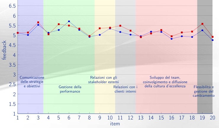
A line chart from a HR report: all the report is generated via markup code, and the red-line is automatically custom-plotted for each report recpient
I'm currently working in Italy as Director of Data Strategy for Docebo, a worldwide leading LMS platform. I've previously worked in Italy and in Germany, managing Data and BI teams in highly digital-focused companies.
My focus is set on the whole strategic data pipeline process: definition of stakeholders' needs and project management, ETL jobs development and E/R modeling, enrichment of data features through machine learning, data visualization (OLAP cubes, dashboards), and finally quantitative and qualitative data analysis, incouding custom reports for decision makers.
I prefer open-source tools like PostgreSQL, PDI, and Python, but I have worked with many free and proprietary solutions, like Tableau and PowerBI. I have experience with cloud (e.g. AWS, Google) and Big Data (e.g. HIVE, BigQuery) solutions, and I have built Docker containers to run ETL and ML tasks in isolated environments. I am a power user of LaTeX, and I have used it to automate large-scale reporting. My additional tech skills include: Linux server management, Database managament, SQL, Bash scripting, JavaScript, Google Analytics.
Milan, Italy
Milan, Italy
Milan, Italy
Berlin, Germany
Milan, Italy
Milan, Italy
"Bocconi" University (Milan, Italy)
Polytechnic University of Bari (Bari, Italy)
Italian mother tongue
English advanced (C1 certificate)
French commercial (B2 certificate)
Russian moderate (A2 certificate)
professional: statistics, business strategy
personal: photography, piano, cooking (patisserie)
I enjoy working on open-source projects (web servers, low cost databases and BI platforms, surveillance systems) with open-source software and single board microcomputers (eg. Raspberry Pi).
Here you can find some of the projects I have worked on (note: only non-confidential projects)
A line chart from a HR report: all the report is generated via markup code, and the red-line is automatically custom-plotted for each report recpient
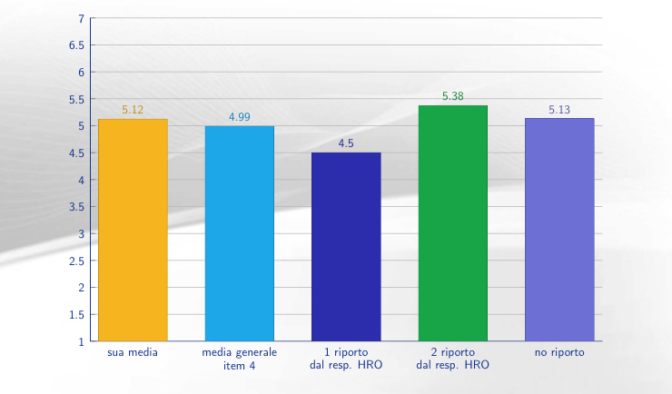
A bar chart from a HR report: the chart is automatically generated from a dataset, resulting from a survey analysis
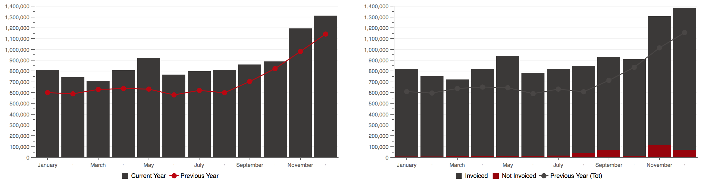
Screenshot from an interactive dashboard: the left chart shows YoY monthly variations, while the right one shows a similar variation but split by group
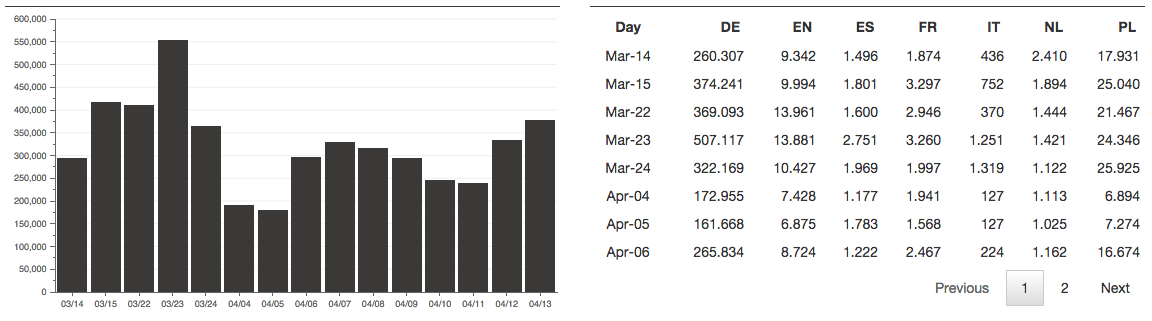
Screenshot from an interactive dashboard: all the items on similar dashboards have been created using SQL, HTML, CSS and JavaScript (with a mix of existing libraries and ad-hoc code)
Interested in my profile? Do you want to discuss some of my projects? Drop me a few lines with the form below (all fields required) and/or get a copy of my CV with my contact info included.